


Corporate design “K und K Wien”
The representation of this special sphere of work was achieved by designing a “new note” as their logo, imprinting a melody on the business cards and using musical staffs as an additional, flexible feature.
Corporate design “K und K Wien”
The unusual its value.” Oscar Wilde
“K und K Wien” is an agency for exceptional artists and culture projects in the field of classical music. For the agency’s logo, two elegant K’s were developed to form a striking note.
Musical staffs complement the designs in a number of ways. They serve as lines for handwritten communications, shine through discreetly from the back side of the stationery, or are shown in vibration to visualize the content of music CDs.
The business cards of “K und K Wien” appeal to several senses at once: They leave their impression visually through the red graphic, haptically through the blind stamp and acoustically through the “K und K” melody which is written in musical notes. The mostly highly musical clientele is challenged to identify the notes as a progression from Fidelio, “Oh namenlose Freude.”
In recognition of the agency’s establishment, the promotional motto “K and K gives S and S*” was conceived. Clients received Viennese “Seidenbonbons” (hard candy which is *sweet and silky) which were packaged in small jars.
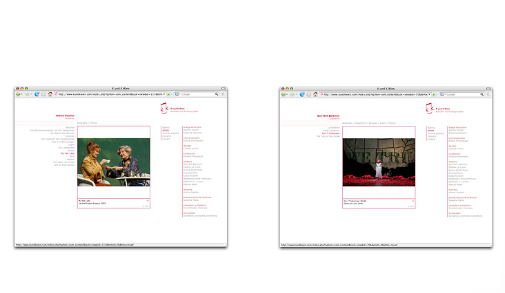
The website of “K und K Wien” carries on the reduced design of the stationery and business cards in its general appearance as well as in individual elements such as the picture gallery and the music player. This conscious restraint creates a website with a light and highly exceptional impact.